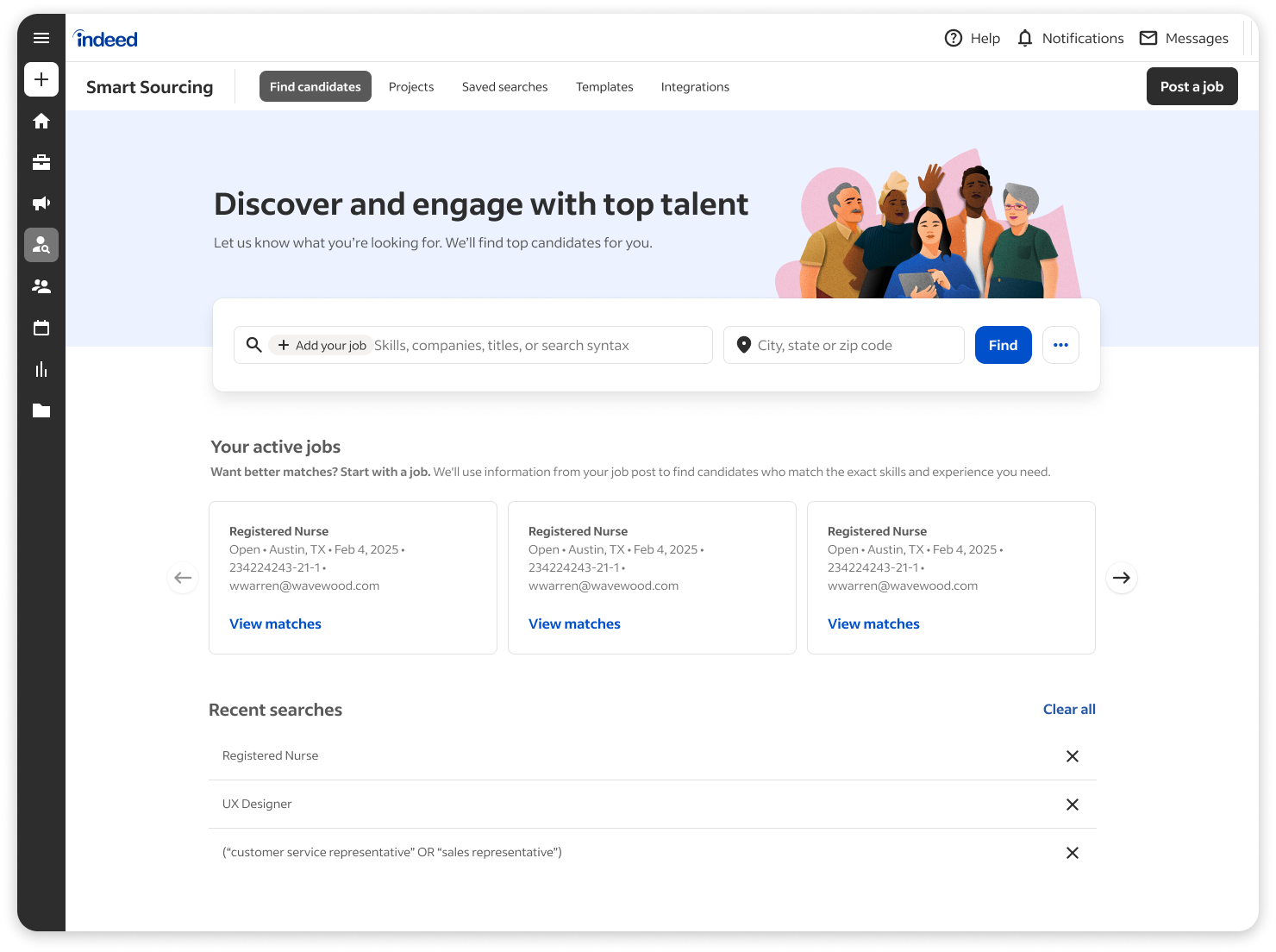
Summary
Indeed's recruiter search tool forced recruiters to choose between system-recommended candidates and keyword search. Recruiters overwhelmingly chose keywords, clicking past the recommendations tab on every visit. Despite being the default, it drove just 10% of resume views.
I led a redesign that unified both approaches into a single search experience. Instead of asking recruiters to trust an opaque matching system, I made it invisible. The result: a 29% increase in jobs receiving positive candidate responses.
Josh's willingness and enthusiasm to go deep on an incredibly specific user interaction, and his discipline in using user research to (in)validate our intuitions consistently transformed ho-hum experiences into unusually well thought-out ones. He's a talented researcher, artfully pulling insights from synchronous and asynchronous user sessions that he himself sets up.
Background
The challenge
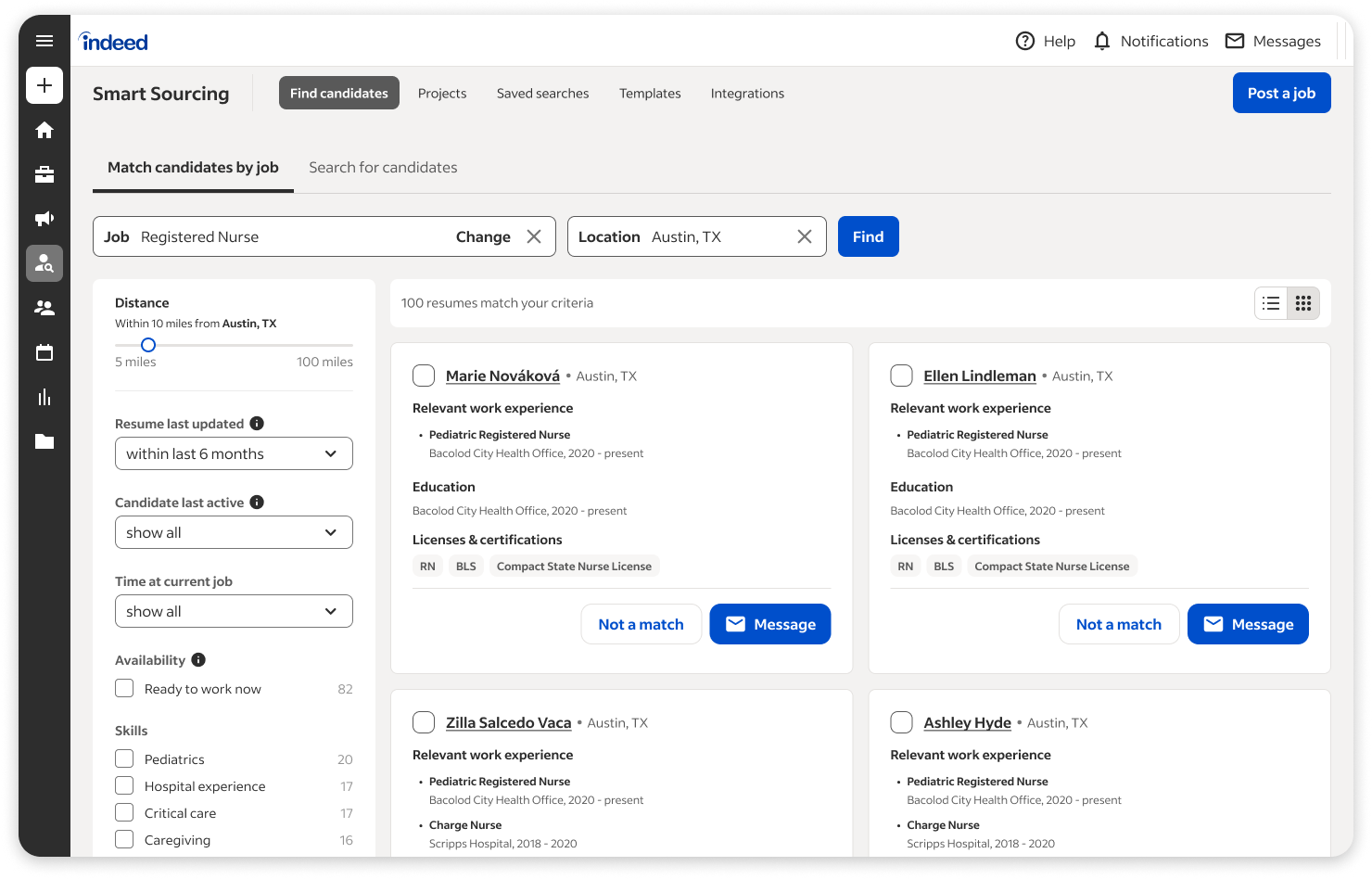
The experience forced a confusing choice: two separate tabs, one for system-recommended candidates ("Matched Candidates") and one for keyword search.
The matching algorithm wasn't bad. It was opaque. Recruiters couldn't see where candidates came from or why they were being shown. The system auto-selected a random job on load, so the recommendations often felt irrelevant. Meanwhile, recruiters had spent years honing their own Boolean search strategies. They trusted keywords because they could see the cause and effect: I typed this, I got that. The matching tab offered no such legibility.
The organizational assumption was "if we make it the default, people will use it." The data proved otherwise. Despite being the default tab, matched candidates drove just 10% of resume views. Millions of recruiters were clicking past it every single visit. The split was originally a technical compromise that became permanent, and recruiters were paying the price.
My role
I led UX strategy and design for this initiative, partnering with product management and engineering to define the vision and ship the solution. I also led stakeholder alignment, helping leadership understand why certain metrics would shift as we fundamentally changed user behavior.
Discovery
Rather than starting with solutions, I dug into the behavioral data to understand why the current experience was failing. I combined analytics analysis with direct recruiter observation and interviews.
Recruiters weren't against getting help finding candidates. They were against not understanding where those candidates came from. This reframed the problem from feature adoption to trust, and it meant the fix wasn't to explain the algorithm better. It was to stop making recruiters think about it at all.
Design process
The gentle prompt pattern
We needed recruiters to use the matching system, but we couldn't ask them to trust it. Years of opaque recommendations had eroded that trust. So instead of making the matching system a separate choice, I designed it as a natural consequence of the actions recruiters already wanted to take.
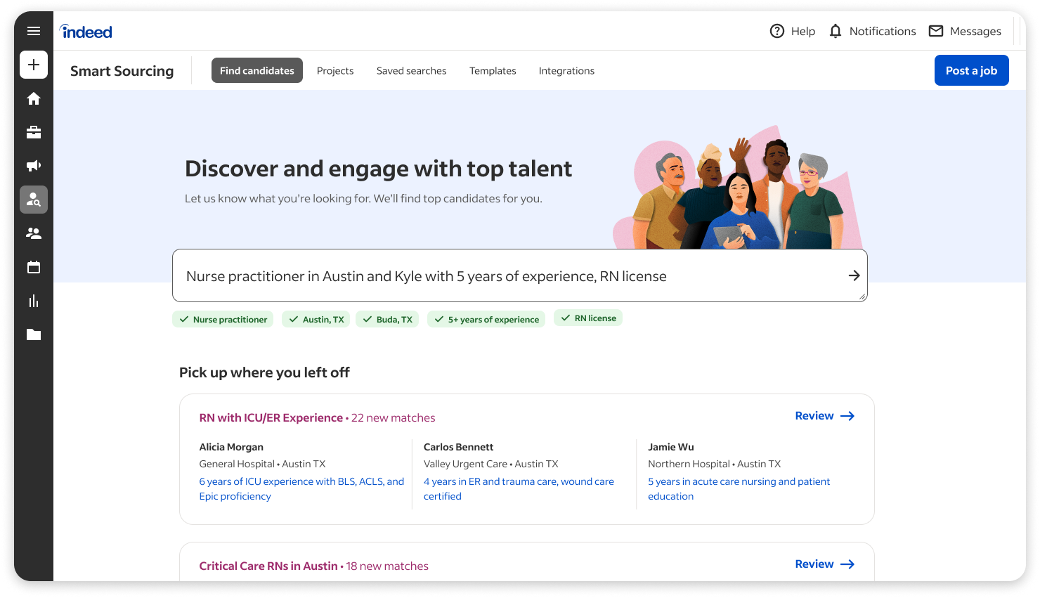
The first thing recruiters see in the new experience is a prompt to "add your job." But it's a suggestion, not a requirement. If they skip it, the typeahead suggests their open jobs before keyword suggestions. This means job context gets attached naturally during search, without forcing anyone.
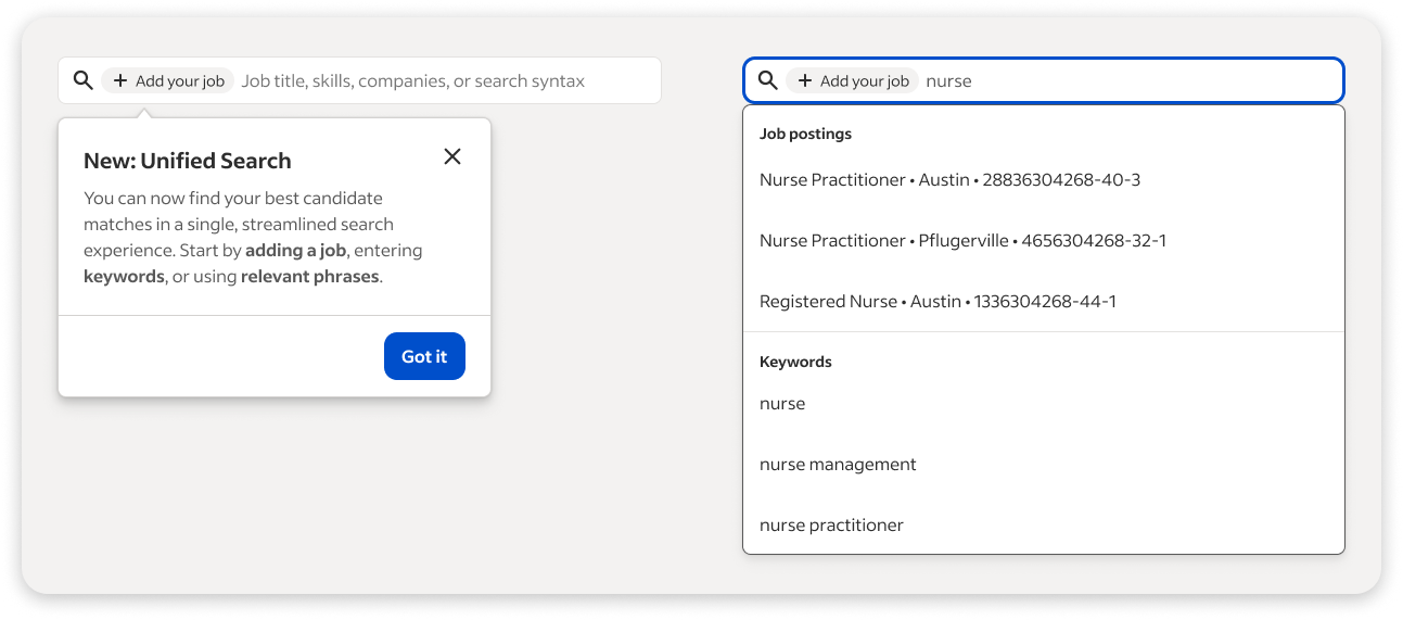
The critical nuance: when a recruiter attaches a job, the system quietly blends matched candidates into the keyword results. The recruiter doesn't see a separate "recommended" section. They just see better candidates. Over time, they learn through their own experience that searches with a job attached produce better results.
The visual builder pattern
Jobs appear as pills in the search bar, making it easy to add or remove context. This pattern felt immediately familiar to recruiters (similar to email address fields) and created a clear visual connection between inputs and results. It also scaled well for future features. We could add other context types like skills, location, or experience level using the same pill pattern.
Getting buy-in
The hardest part of this project wasn't the design. It was convincing stakeholders that the best way to increase adoption of the matching system was to stop showcasing it. The engineering team had invested years in the algorithm, and removing its dedicated tab felt like a step backward. Leadership worried that engagement with matched candidates would drop even further.
The 10% stat did the heavy lifting. It was hard to argue that the current approach was working when 90% of recruiters were ignoring it. Once the team saw the behavioral data, they aligned on the approach: we weren't removing the matching algorithm. We were removing the barrier to its adoption.
Solution
How it worked
We replaced the two-tab system with a single search interface. Recruiters can now add job context, keywords, or both in one place. The system blends matched and keyword results together.
When recruiters attached a job to their search, the system used that job's requirements to surface matched candidates alongside their keyword results. But it didn't label them as "recommended by our algorithm." They just appeared as relevant candidates.
Recruiters noticed that searches with a job attached consistently produced better candidates, and they started attaching jobs more frequently on their own. They built trust in the matching system through their own experience, without us ever asking them to.
Designing for the future of search
I also designed the unified search as scaffolding for natural language search.
The old two-tab system locked recruiters into Boolean queries and rigid keyword fields. The new unified interface, with its visual builder pattern and contextual job pills, was built to evolve. The same search bar that today accepts keywords and job context could tomorrow accept a plain English query like "senior React engineer in Austin with healthcare experience." The structure was already there.
Recruiter search was clearly heading toward more conversational, LLM-powered interactions. I wanted to make sure the interface we shipped today wouldn't need to be torn down and rebuilt when that future arrived.
Results
By removing the forced choice and making the matching invisible, we saw improvements across the entire recruiting funnel.
The increase in positive connections, particularly for searches with a job attached, showed that recruiters were discovering the value of the matching system through their own experience. They weren't told the algorithm was better. They saw it for themselves.
What recruiters said
- "The changes are definitely an improvement. It's a lot more streamlined."
What I learned
Every time we put the matching algorithm in a separate tab or tried to explain why it was better, we were reminding users that they were supposed to trust something they didn't understand. When we made the matching just another part of the results, recruiters formed their own positive associations through experience. Sometimes the best way to build trust in a system is to stop asking for it.