
Summary
The AXS mobile app powers event ticketing for over 55 million people annually across venues in the US, UK, and Europe, including Coachella, LA Lakers games, Red Rocks Amphitheater, and Wembley Stadium.
I led a research-driven effort focused on solving a critical problem: the "AXS Mobile ID" (a QR code used for multiple purposes) was confusing fans and creating friction at event entry. Through extensive research and testing, I discovered that the solution required adding intentional friction. We needed to provide context before showing the code, which contradicted internal assumptions but ultimately led to a 68% increase in fans getting into venues without issue and reduced support calls by 42%.
While leading the mobile app design, Josh conducted UX research that surfaced critical themes and insights. He framed those findings to stakeholders, executives, and the larger company in a concise way that provided a clear path forward.
Background
The challenge
The AXS Mobile ID is a QR code that serves multiple purposes:
- Event entry (like a ticket)
- Payment method at concessions
- Account identification
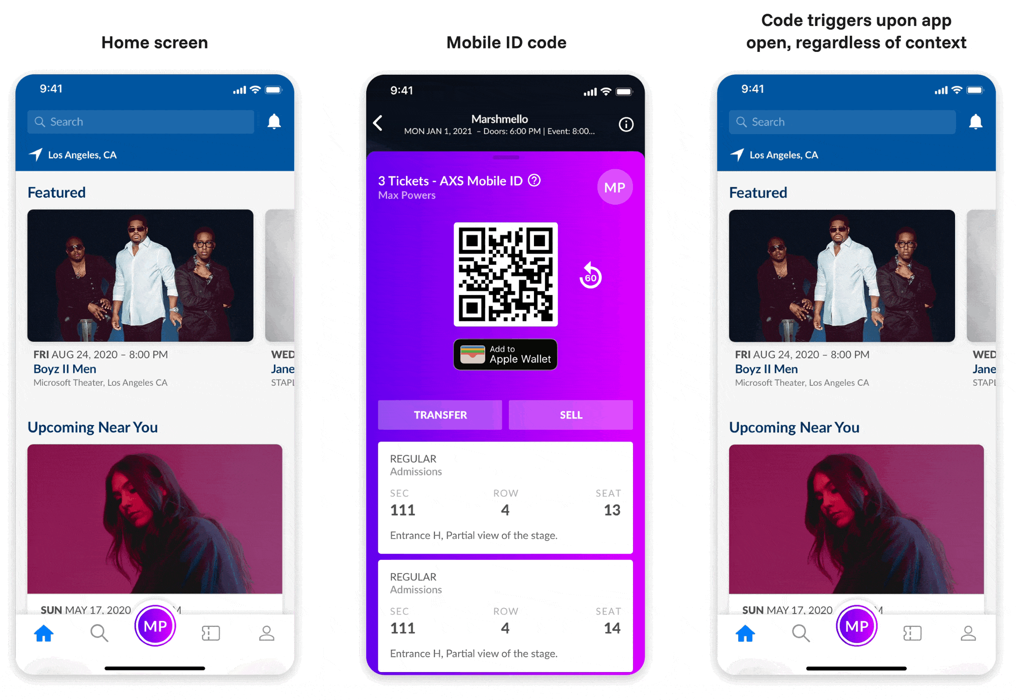
Conversations with customer care revealed that many users were confused by the Mobile ID. Leadership believed fans would intuitively understand these different uses. As a band-aid fix for confusion, they had implemented an aggressive solution: automatically displaying the Mobile ID every time the app opened, regardless of whether fans had tickets.
This only deepened fan confusion and frustration.
The high-stakes moment
Our research revealed that most users download the app either the day before or at the event itself. This creates a high-stress touchpoint where confusion can ruin the experience. Fans just want to get in, and forcing them to learn new patterns in that moment creates unnecessary friction.
The internal bias
There was a strong organizational belief that:
- "Mobile ID" was self-explanatory
- Fans would understand a single QR code could serve multiple purposes
- Any additional steps would create unwanted friction
My research would prove all three assumptions wrong.
My role
I owned UX design and product strategy for event entry, creating all wireframes, user flows, and other UX artifacts before partnering with two Visual Designers to bring the concepts to life. When we lost our PM early in the project, I stepped into a product leadership role while mentoring junior designers and collaborating with other UX team members who provided valuable support. With limited resources, I drove lean research to uncover insights that would challenge organizational assumptions and inform our design decisions.
Discovery
Key research questions
Competitive analysis
I analyzed 13 apps across events (Ticketmaster, Seatgeek), rewards (Starbucks, Chipotle), and payments (Venmo, PayPal) to understand QR code implementation patterns.
Successful apps always provide context before displaying QR codes, never assuming users understand their purpose. They also consistently use 2 taps to access tickets, providing event-specific context to avoid overwhelming stressed fans.
User testing round 1: Validating the problem
I ran 40 participants across 4 tests to validate the problem with statistical significance.
Participants avoided the Mobile ID feature entirely, telling us "Mobile ID means nothing to me" and "Why is this popping up? I don't have tickets." The term had zero meaning, and showing the code without context created anxiety.
User testing round 2: Testing solutions
I hypothesized that adding context before showing the code would improve understanding, even if it adds a tap.
Functional names worked. Context reduced anxiety. Specificity built confidence.
Making the case to leadership
The research clearly showed we needed to add steps (intentional friction) which went against everything stakeholders believed. I faced significant resistance:
Through persistent advocacy backed by research data, the team aligned on implementing contextual experiences.
The solution
Design principle: Context before code
Instead of fighting user mental models, we'd work with them. Every QR code appearance would be preceded by clear context about its purpose.
The framework:
- User initiates an action (view tickets, pay, etc.)
- We explain what they'll see and why
- QR code appears with reinforcing context
This approach scales for any future use while reducing cognitive load in the moment.
Implementation
Redesigning the navigation to be context-first
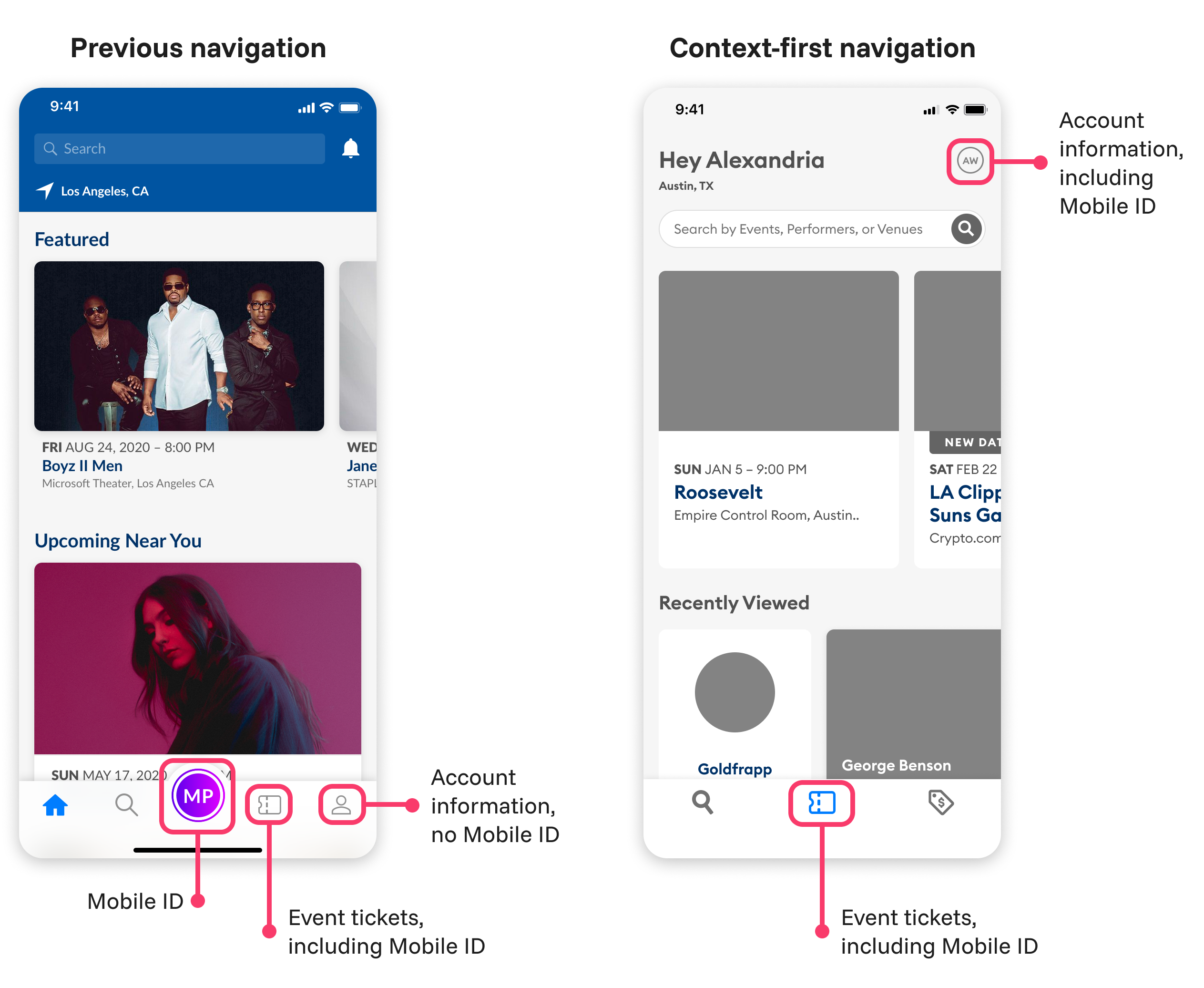
The Mobile ID was accessible from the home screen via an icon with the fan's initials. This would display the Mobile ID even if no events were coming up. In addition, there was a ticket icon that would show fans their upcoming events. These events would also display the Mobile ID, causing even further confusion.
With the proposed context-first design approach, fans are required to enter a screen such as Account or Events before they're able to access a Mobile ID code, providing them with a concrete point of reference.
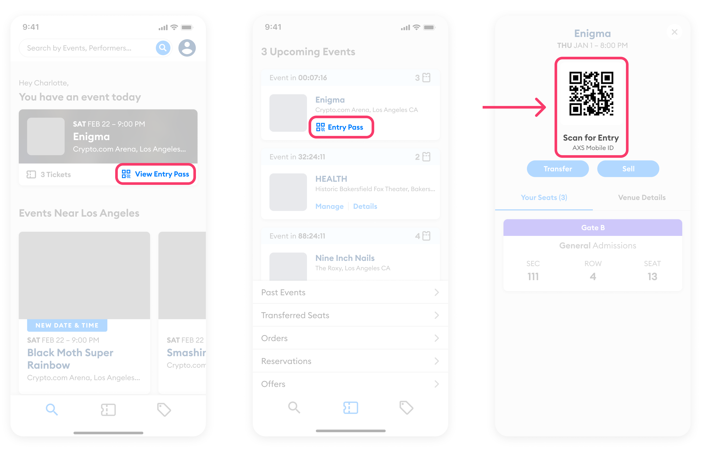
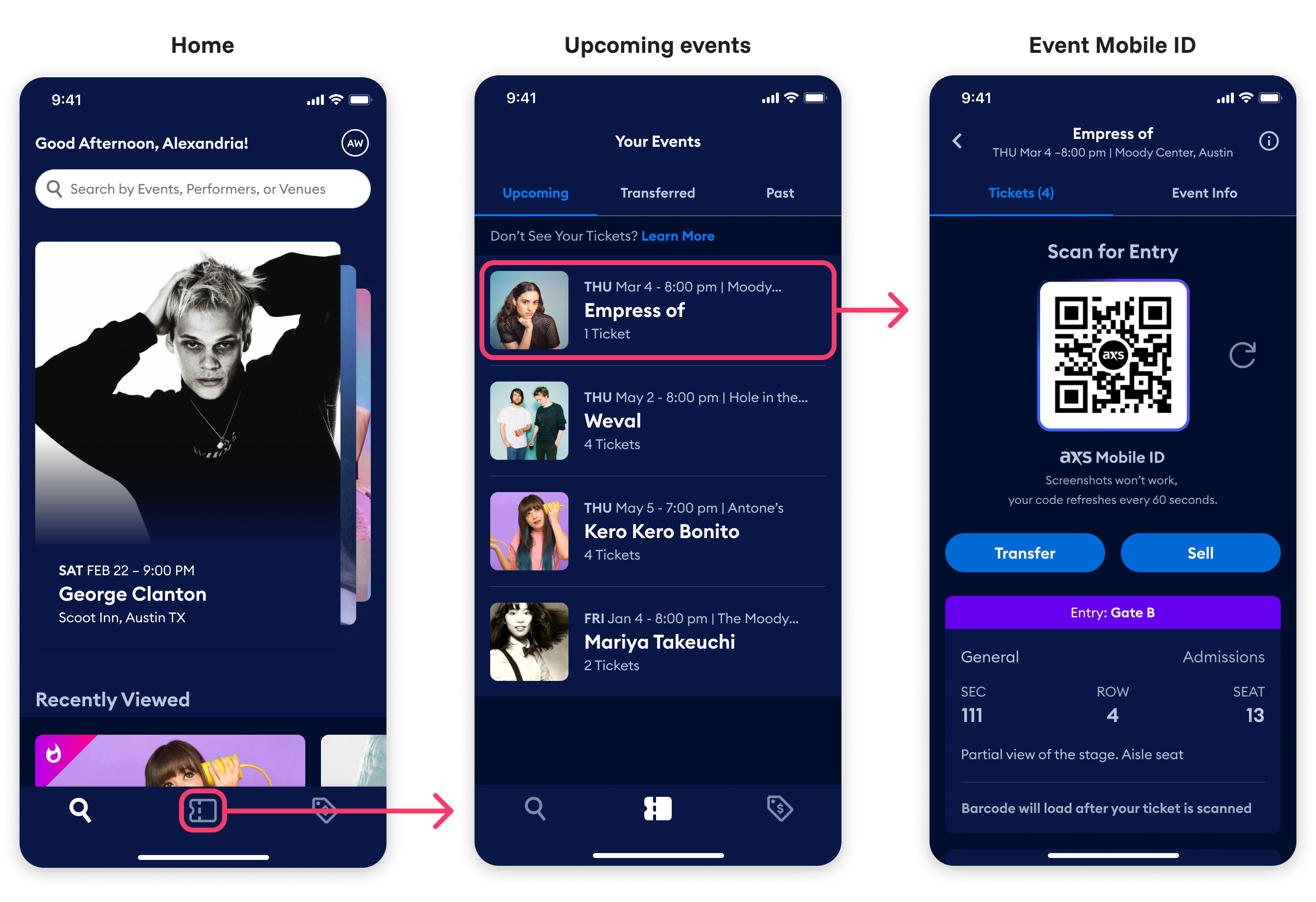
Redesigning with context: Event entry
For event entry, fans are now required to access the Mobile ID through the context of an upcoming event. Additionally, I added the text "Scan for entry" to the screen to underscore the functionality. These changes were universally understood by test participants to indicate that the Mobile ID would be used for entry to that event.
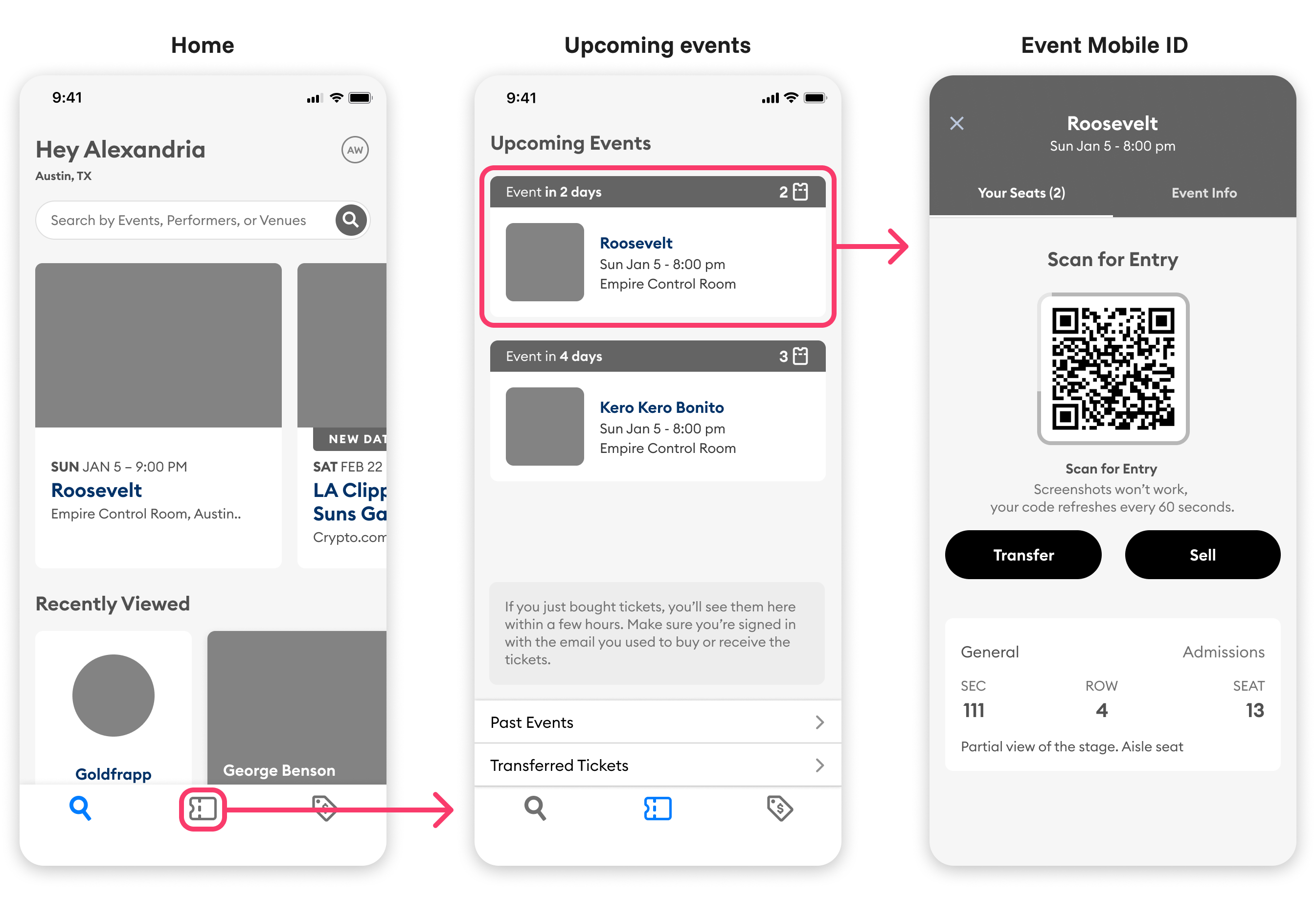
- User taps on the ticket icon to view their upcoming events
- User taps on an event
- The Mobile ID displays "Scan for Entry" with the specific event name and location
Wireframes (part of functional prototype)
High fidelity (created by Visual Design partners)
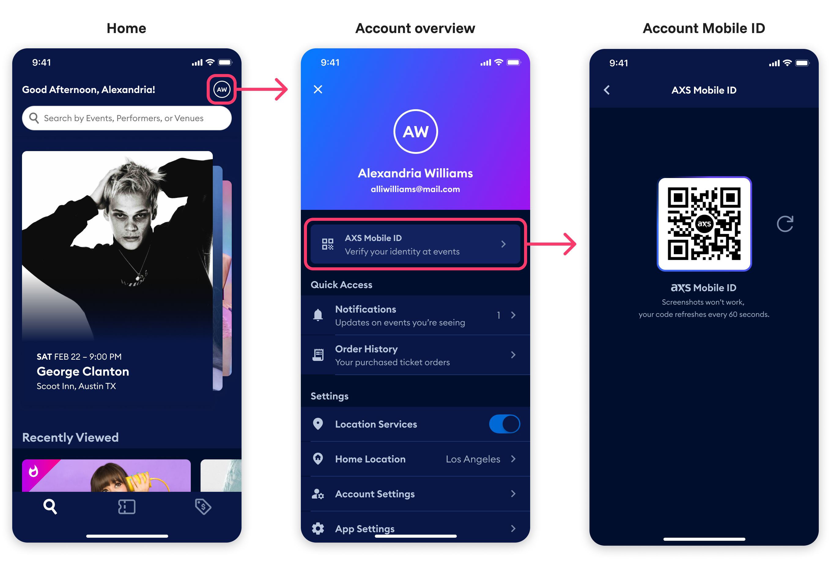
Redesigning with context: Account access
Moving Mobile ID access from the home screen to the account screen provided additional context for the fan to understand that the QR code is tied to their account and is their personal ID in the AXS ecosystem.
- User goes to account settings
- Their name appears prominently next to the AXS Mobile ID button
- Clear explanation: "Verify your identity at events"
- No unnecessary information on the Mobile ID screen
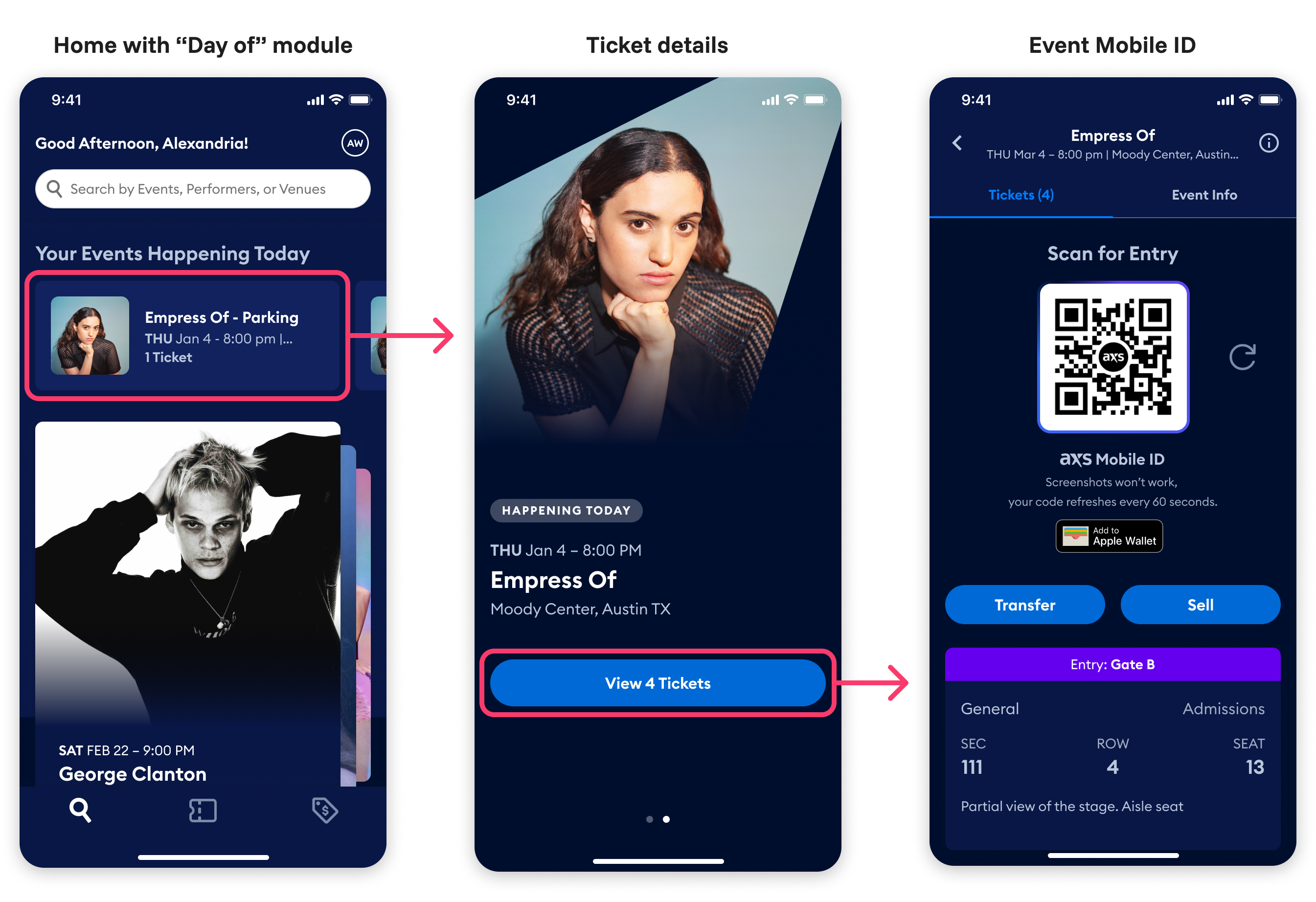
New feature idea: "Day of" event entry
The contextual approach enabled us to create a new streamlined entry experience that fans easily understood and Box Office staff could use to help fans find their tickets.
- Events happening today appear prominently on the home screen
- Tapping the event shows details before presenting ticket options
- The Mobile ID displays "Scan for Entry" with the specific event name and location
As a bonus, the new "Day of" experience created a new opportunity for contextual advertising around events. The Marketing team was very pleased.
How Mobile ID fits into the larger app experience
While this case study focused on optimizing event entry, the solution needed to work seamlessly within the context of the redesigned app. This AXS promotional video shows the complete app experience with the Mobile ID in context:
Results and reflection
The power of good friction
This project proved that not all friction is bad. By adding one thoughtful step (context before code) we:
- Increased successful event entry by 68%
- Reduced support calls by 42%
- Created reusable context-first design pattern adopted by partner teams
The impact reached beyond AXS itself. After reviewing our research, several partner teams implemented similar changes at their venues, extending the benefits to additional fans.
Challenging assumptions
The biggest challenge wasn't the design, it was aligning around a new way of thinking. The team had long believed that fans would intuitively understand the "Mobile ID," but our research revealed a different story: fans needed more context, not fewer steps.
By grounding every decision in user research and being persistent with data, we transformed a confusing experience into one that actually works for the millions of fans who use it.
The lesson? Sometimes the best UX decision is to slow users down just enough to help them succeed.