Summary
LegalZoom is a $5B legal technology leader that has formed over 3.7M businesses since launch. With nearly half its revenue coming from business formation at $79+, leadership needed to know: would anyone choose free formation from an unknown brand? And could we even test that without a multi-month engineering effort?
I led UX for Ribbon, a stealth startup created to answer these questions. When leadership pushed for a full-featured clone of LegalZoom, I advocated for something simpler: a lightweight capture flow with human-powered fulfillment behind the scenes. This scoping decision let us validate demand without touching legacy systems. The project's success led to my promotion from Lead to Principal Designer.
Josh wears many hats -- experience design, product ideation, software expert, UI designer, and even developer -- and is able to communicate and execute complex ideas clearly and consistently.
Background
The business question
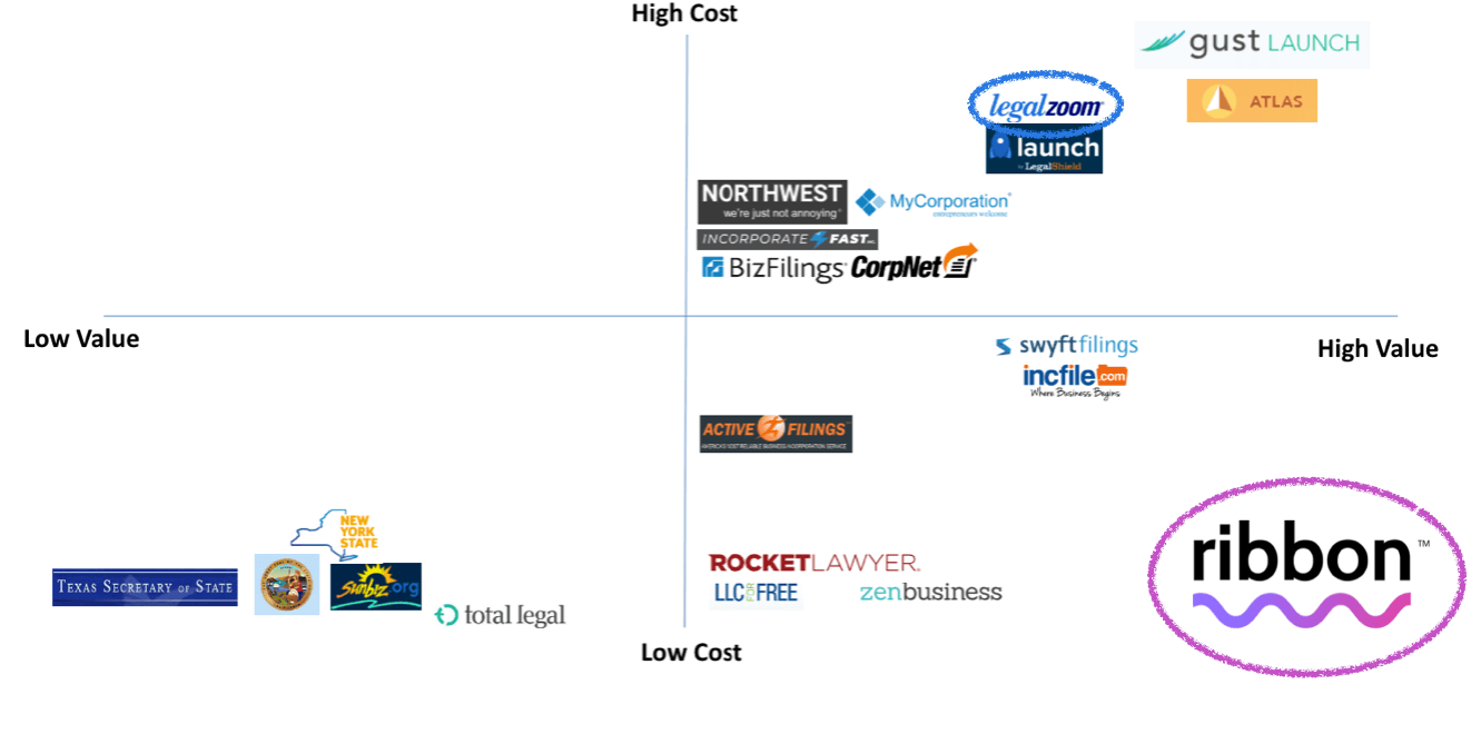
LegalZoom charged $79+ for business formation. Competitors were racing to the bottom. Leadership wondered if freemium could work, but couldn't risk testing it on the core product.
The challenge wasn't just strategic. Fifteen years of legacy systems meant any real experiment would require months of engineering work just to stand up a new pricing model.
The opportunity
Enter Ribbon: a stealth startup with permission to test what seemed unthinkable. Separate brand, separate traffic, no risk of cannibalization. Our mission was simple: prove whether demand exists at $0 from an unknown brand.
My role
As Lead Designer, I partnered with VPs of Marketing, Creative, and UX on product strategy. I worked alongside a Product Designer to develop the experience and visual identity. My most significant contribution was pushing back on the initial scope to get us to learning faster.
The scoping decision
The original plan
Leadership wanted to build a near-complete replica of LegalZoom's formation flow. This would have required integrating with the same legacy fulfillment systems, the same state-by-state filing logic, the same complex question sequences. We'd be months away from learning anything.
The question I asked
We weren't trying to build a sustainable product. We were trying to answer one question: will people form businesses through an unknown brand if it's free?
I advocated for a Wizard of Oz approach. Make the experience feel real to users, but handle the complexity through humans rather than systems.
The solution
Instead of automating everything, we designed a simple capture flow:
- User answers about 10 questions
- We collect their information and intent
- A fulfillment partner calls them to finalize the details and complete the filing
To users, it looked like a real product. Behind the scenes, we'd built just enough to get signal on demand without touching legacy infrastructure.
Design approach
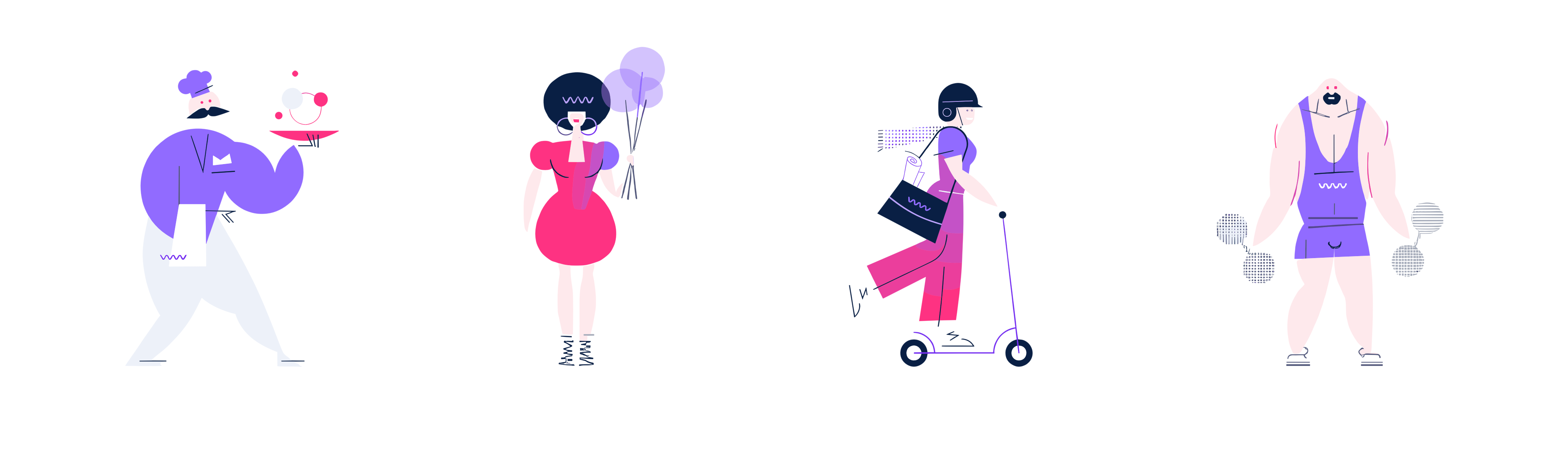
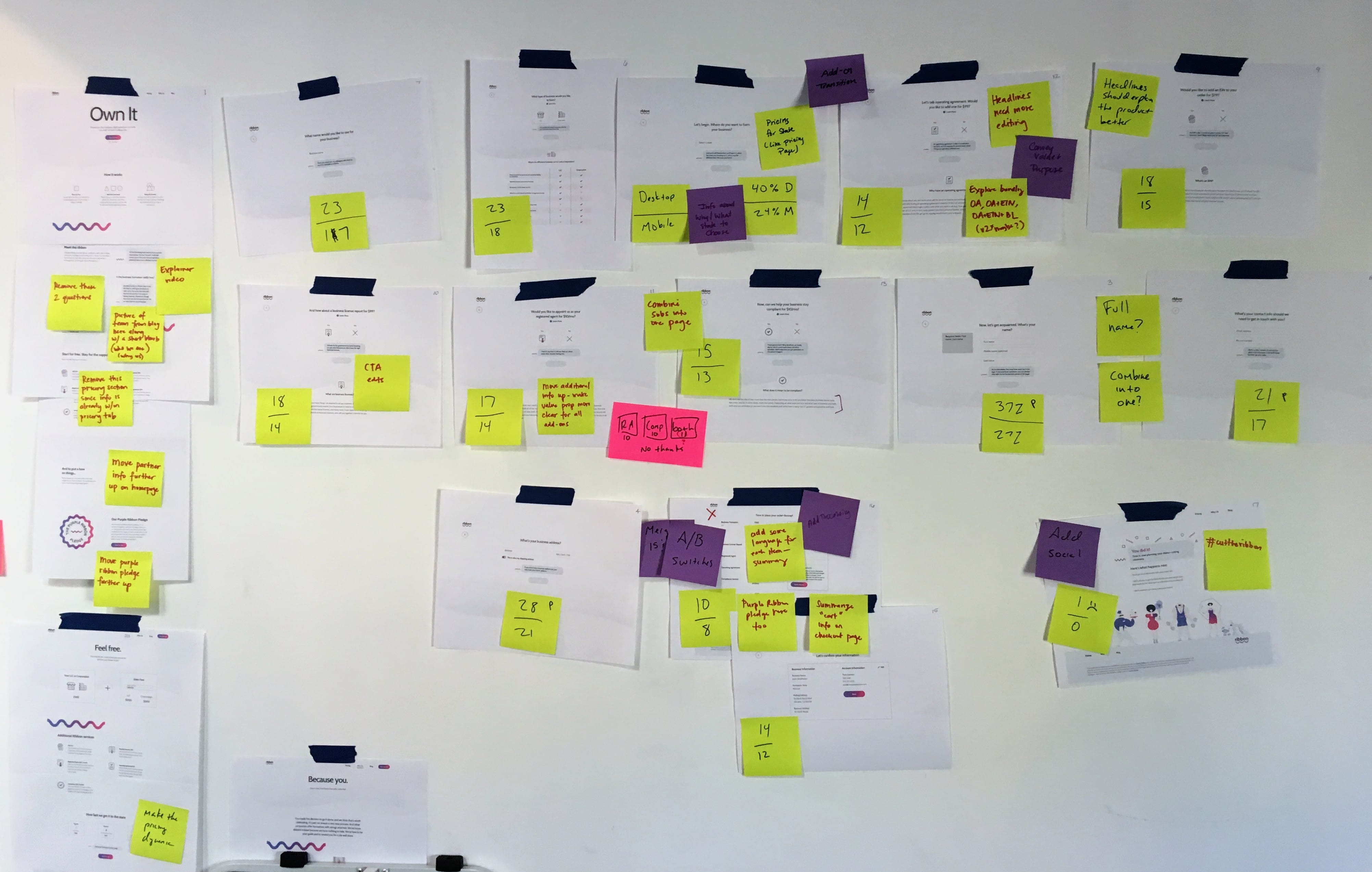
Creating the experience
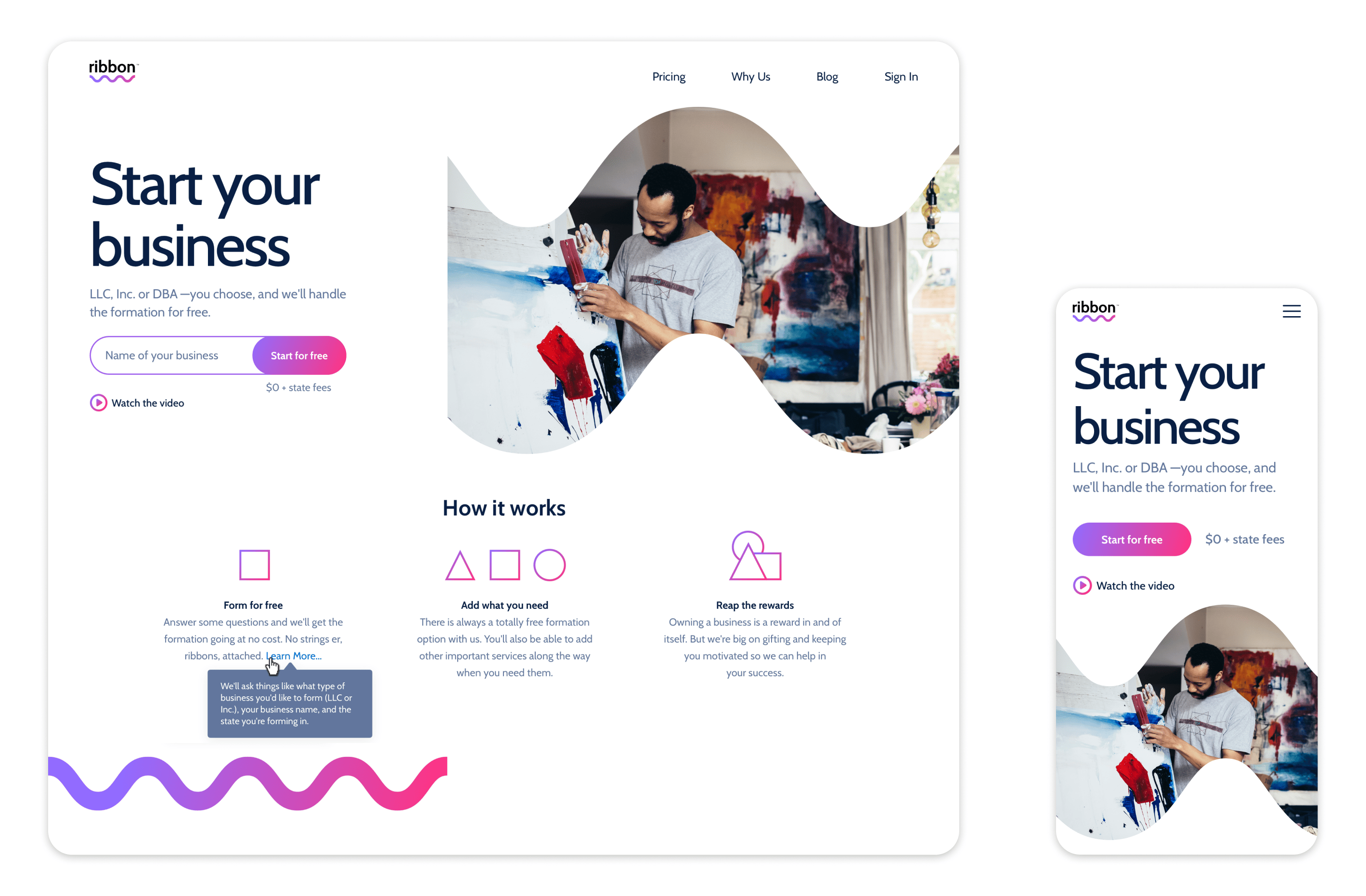
We developed a design system called Thread to enable rapid iteration. The visual design balanced playfulness with professionalism. Business formation should feel accessible, not intimidating.
The capture flow started with a single friendly question: "Where do you want to form your business?" Each step after that was designed to feel conversational rather than bureaucratic.

Building trust for an unknown brand
Ribbon had no reputation to rely on. We needed users to trust us with their business formation despite having never heard of us. Every design decision aimed to build credibility: clear value communication, transparent process explanation, and a visual language that felt professional without being corporate.
One of the ways we did that was by making promotional videos, including this one featuring my dog/life companion Mochi.
Validation
We launched with limited AdWords traffic, capping orders at 40 to stay within our fulfillment partner's capacity. Despite being an unknown brand competing against LegalZoom itself, we saw real conversions.
I conducted follow-up calls with users who completed the flow. They confirmed the experience felt simple and trustworthy. They hadn't questioned whether Ribbon was a legitimate service.
Results and impact
What we proved
The experiment answered the core question: yes, people will form businesses through an unknown brand if the price is right. Demand exists at $0. The LegalZoom name isn't required.
This gave leadership concrete evidence to inform pricing strategy discussions for the core product. The question shifted from "could freemium work?" to "how do we build out the full model?"
What I learned
Sometimes the most valuable design decision is what you choose not to build. By scoping for learning rather than shipping, we got signal in weeks instead of months.
The project's success led to my promotion from Lead to Principal Designer.