Summary
O'Reilly Auto Parts, a Fortune 500 company valued at over $10B, employs over 90,000 people across 6,000+ stores. Every year during benefits enrollment, their corporate phone system would crash from the surge in support calls, requiring expensive temporary staff to manage the crisis.
I led a rapid redesign of the benefits enrollment application two months before launch. Through guerrilla usability testing and iterative design, I identified that the confusing landing page was the primary pain point. The redesigned experience reduced support calls by 95% and eliminated the need for temporary staff, saving tens of thousands in overhead costs.
Background
The challenge
Every October, O'Reilly's benefits enrollment period created a predictable crisis. Employees couldn't navigate the enrollment system, leading to a surge in support calls that would literally crash the corporate phone system. HR had to hire temporary staff just to handle the chaos.
This expensive pattern repeated year after year, frustrating employees trying to make important healthcare decisions.
The opportunity
Two months before the next enrollment period, a colleague and I saw an opportunity to break this cycle. We secured stakeholder buy-in for a rapid redesign, arguing that even modest usability improvements could dramatically reduce support needs.
My role
As a UX team of one, I handled all aspects of the redesign. I conducted usability audits and guerrilla testing to understand the problems, designed new information architecture and UI to solve them, and collaborated closely with engineers to ensure everything could be built within our tight timeline.
Discovery
Auditing the existing experience
I began with a comprehensive audit of the application, conducting quick guerrilla usability studies to observe how typical employees interacted with the platform.
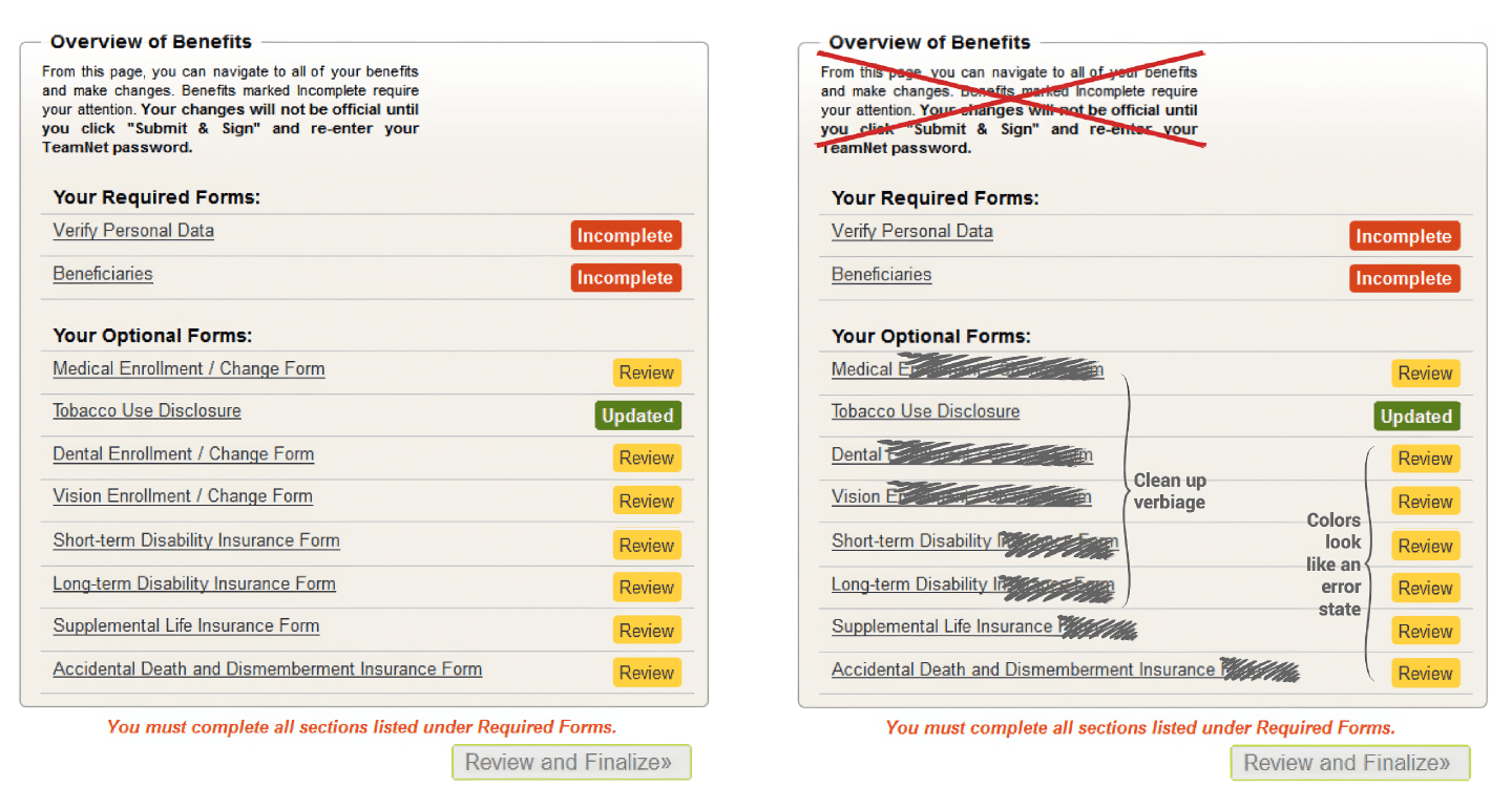
Key findings
The usability studies revealed that the landing page was creating immediate confusion about where to start. Navigation labels didn't match how employees thought about their benefits, and the visual hierarchy failed to guide users to required actions. The flow between steps felt disjointed and unclear.
Critical insight: The landing page was the biggest barrier. If employees couldn't figure out where to begin, they immediately called for help.
Design process
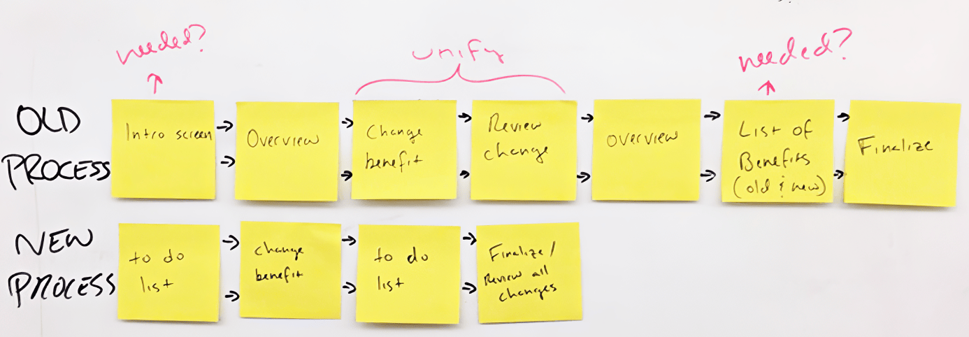
Mapping the ideal flow
My research highlighted two core problems: the application's flow confused users, and the design lacked visual cues for next steps. I mapped out the task flow using post-it notes to explore streamlining options.
Key design decisions
Through sketches and low-fidelity prototypes, I explored ways to simplify the experience. The solution consolidated multiple tasks into single steps and created a visual hierarchy that naturally guided users through the flow.
But the biggest win was the simplest change: I renamed "Overview" to "Action Required."
"Overview" was passive. It told users what existed, not what to do. Employees would land on the page, see a bunch of options, and immediately call support asking where to start. "Action Required" answered that question before they could ask it. Start here. Do this.
Testing and iteration
I conducted another round of guerrilla usability tests to validate the design concepts. Based on user feedback, I made rapid iterations while collaborating closely with engineers to ensure feasibility.
Implementation
The redesigned experience
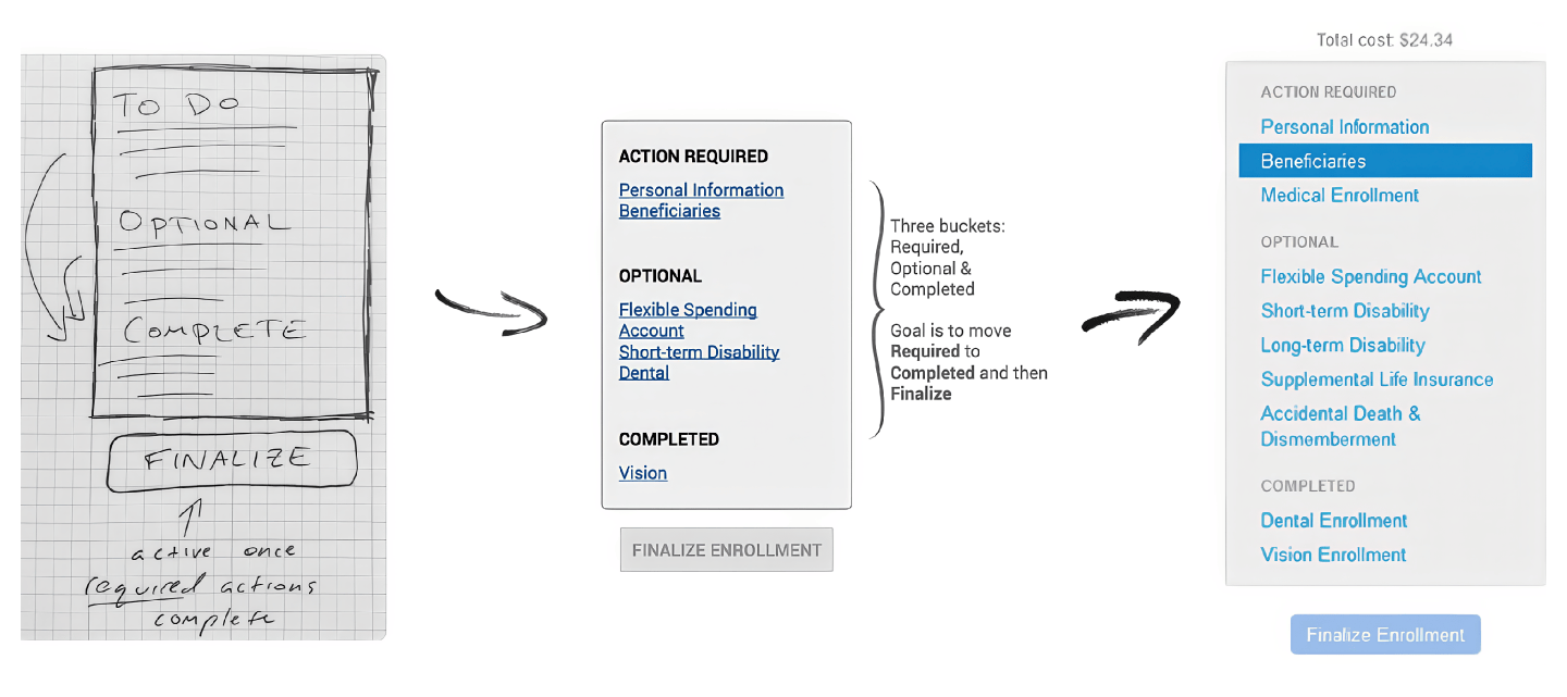
The final design transformed the confusing landing page into a clear, action-oriented interface:
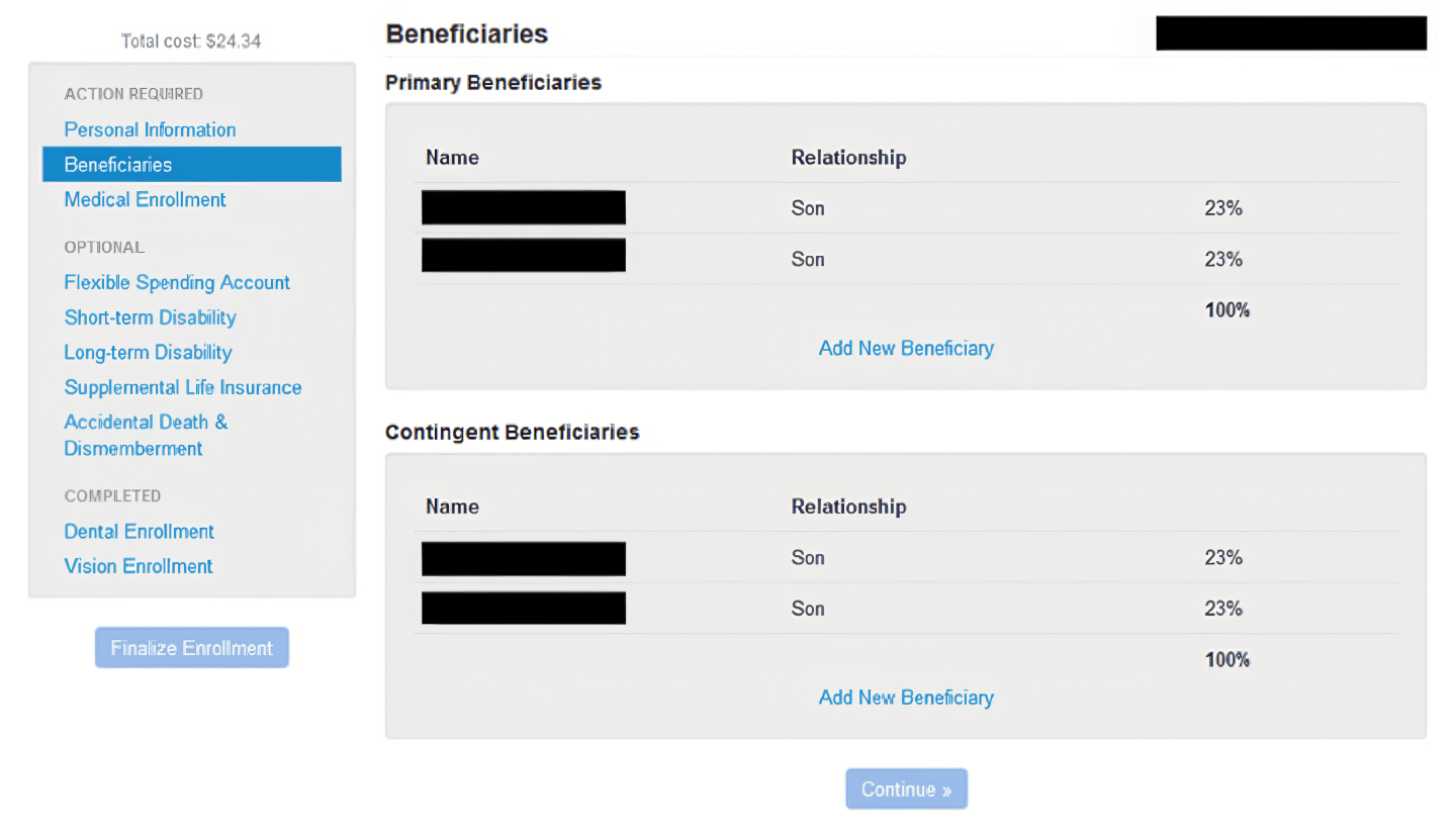
The new design featured a prominent "Action Required" section that showed employees exactly what they needed to do. Simplified navigation reduced cognitive load, while the visual design guided users naturally through the enrollment process. By consolidating steps, we minimized the number of screens employees had to navigate.
Launch preparation
Within one month of finalizing the design, the redesigned application was successfully launched. We met our deadline with days to spare, allowing time for final testing and refinements.
Results and reflection
Impact
The week of launch, I stopped by the Benefits department to check on the rollout. It was usually their most chaotic week of the year. Instead, the phones were quiet.
Support calls dropped by 95%. The phone system didn't crash. No temporary staff were needed. The company saved tens of thousands in operational costs from one project.
We didn't rebuild the entire system. We fixed the front door.
The project became an internal case study for UX ROI, which led to increased investment in design. A few months later, my title was changed from Software Engineer to UX Designer -- the first at the company. I went on to be a UX team of one for around 100 internal web apps.