
Summary
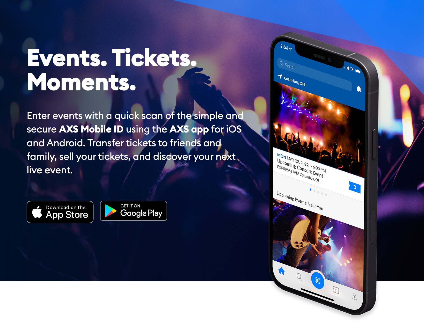
The AXS mobile app powers event ticketing experiences for over 55 million people annually across venues and events like Coachella, Firefly Festival, LA Lakers games, O2 London, Red Rocks, and Wembley Stadium.
I led a research-driven redesign of the AXS mobile app. In this case study, I’ll focus on the work I did around clarifying the “AXS Mobile ID” entry process. Through rapid prototyping and usability testing, I improved event entry success by 68% and reduced app-related support calls by 42%, enhancing the overall experience for millions of fans.
While leading the mobile app design, Josh conducted UX research that surfaced critical themes and insights. He framed those findings to stakeholders, executives, and the larger company in a concise way that provided a clear path forward.
Background
The challenge
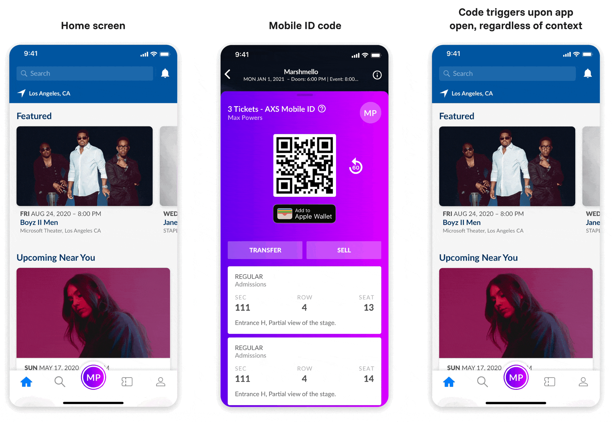
The AXS Mobile ID (a scannable QR code for entering events) was confusing to users, leading to frustration and increased customer support calls. As a stopgap fix, stakeholders decided to automatically show the Mobile ID every time the app was opened, even if users didn’t have tickets. This only deepend user confusion.
The goal of this project was to improve this essential feature — easily the most important in the app — so millions of users could easily understand it, while also designing with future improvements in mind.
My role
I led UX discovery and product strategy, collaborating closely with visual designers to ensure alignment and consistency, and stepped into a product leadership role when we lost our dedicated PM early in the project. With limited resources, I drove lean qualitative and quantitative research to uncover insights that informed our design decisions and product priorities.
Throughout the process, I partnered closely with engineering, ensuring the final product matched our vision down to functionality, visual details, and animations.
Discovery
Key research questions
Competitive analysis
I analyzed 13 apps across different categories:
| Category | Apps | Code Location | Context Provided |
|---|---|---|---|
| Events | Ticketmaster, Seatgeek, Vividseats | Tied to tickets | Context at each step |
| Rewards | Starbucks, Chipotle | Front and center | Minimal |
| Payments | Venmo, PayPal | Multiple locations | Clear labels ("Get Paid") |
Key insight: Apps always provide context around the functionality of a QR code before displaying it
User testing round 1
Setup: 40 participants, 2 test variations
| Variation | User Behavior | Success Rate | Key Quote |
|---|---|---|---|
| Button labeled "Mobile ID" | Clicked unrelated elements, did not associate "Mobile ID" with event entry | Low | "Mobile ID means nothing" |
| Unlabeled QR code | Associated code with tickets but confused by multiple uses | Medium | "I had no idea where to click" |
Takeaways:
- “Mobile ID” as a term was not understood by participants
- Using a QR code for multiple purposes was confusing
- Familiar patterns matter under stress
User testing round 2
New hypothesis: Context before code reduces friction
| Variation | User Behavior | Success Rate | Key Quote |
|---|---|---|---|
| "Entry Pass" with context | Very high | "It looks like a barcode which I would assume would be scanned" | |
| "Mobile ID" with context | Low | "Mobile ID rather than Ticket(s) made me think twice" |
Key learnings
Users don’t learn under pressure
Design for existing mental models, especially during stressful moments like event entry.
Context beats education
Don’t teach terminology. Show features when users already understand why they need them.
One code, one purpose
Multi-purpose QR codes confuse users regardless of labeling.
Patterns matter
Users bring expectations from other apps. Work with them, not against them.
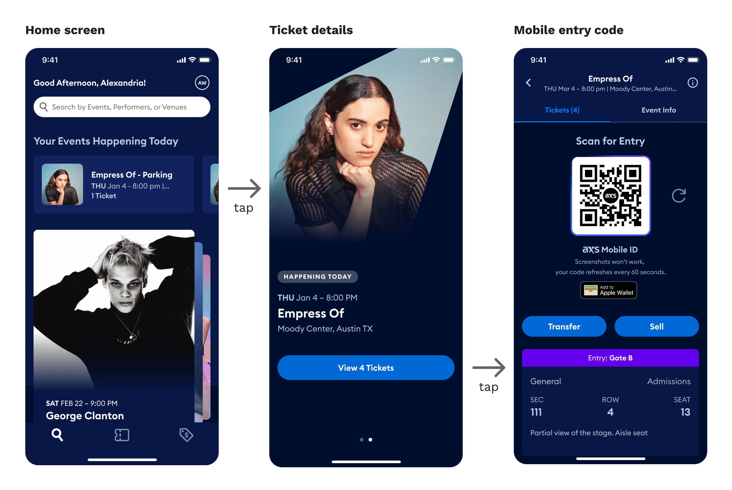
The solution
Design principle: Context before code
Most users download the app right before events (high stress moment). Instead of teaching “Mobile ID,” we provide clear context for each use.
The framework:
- User starts action (view tickets, pay, etc.)
- Clear label explains the QR code purpose
- Mobile ID appears with context
This scales for future features like mobile ordering while reducing cognitive load.
Providing additional context to each use of the AXS Mobile ID
New feature: “Day of” event entry
Video walkthrough of redesigned app
Reflection
This project showed why challenging internal assumptions matters. Stakeholders thought “Mobile ID” was self-explanatory. Testing proved otherwise. By focusing on user mental models over internal terminology, we built something that actually works for people.