Summary
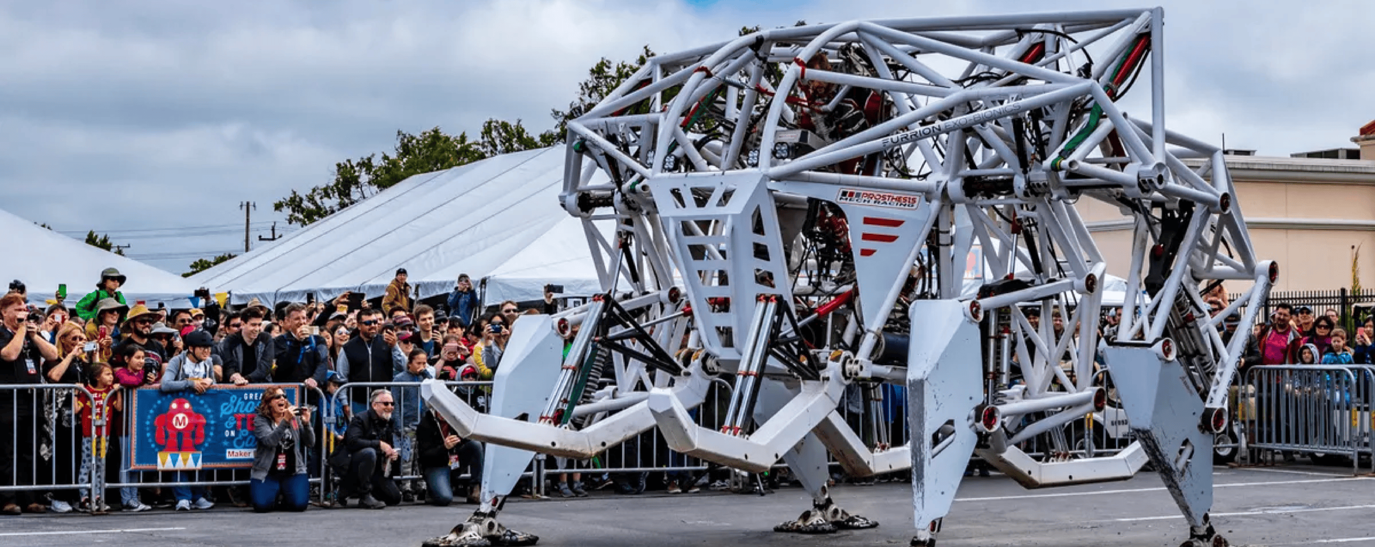
MakerSpace was a social network created by Maker Media, the company behind Make: Magazine and Maker Faire, events that attracted over 1.5 million attendees annually across the globe. The platform aimed to connect makers worldwide and foster the same creativity and collaboration found at physical Maker Faire events.
I led UX design for a remote, cross-functional team with startup-like autonomy. We launched at World Maker Faire New York, where we conducted on-site user interviews and onboarded our first 700 users. The launch garnered press coverage from TechCrunch, Engadget, and Fast Company.
Josh is not about just trying to out-creative the next designer, but really listens to the user and uses his powers of observation for good.
Background
The challenge
Maker Media had built a global movement through physical events, but lacked a digital platform to connect makers between events. The maker community was fragmented across forums, social media, and local groups. Makers struggled to share projects, find collaborators, and maintain connections made at events.
The opportunity
With Maker Faire’s massive reach, we had a unique opportunity to create the definitive online home for makers. Leadership wanted to launch at World Maker Faire New York, which created a brief timeline that kept us focused on what mattered most.
My role
As lead UX designer, I owned all design aspects from wireframes to final UI. I conducted pair design sessions with developers via video chat for real-time iteration and crafted the visual identity for promotional materials.
Discovery & design process
Understanding the maker community
With limited time for formal research, I combined insights from Maker Media’s community knowledge with direct outreach to makers for feature ideas.
Key insight: Makers valued sharing their process as much as their final projects. They wanted to inspire and teach others.
Design principles
| Principle | Why it matters | How we applied it |
|---|---|---|
| Show the journey | Makers learn from process, not just outcomes | Multi-step project documentation |
| Make collaboration visible | Community thrives on helping each other | Comments, remixes, and co-creator credits |
| Welcome all skill levels | Everyone starts somewhere | No gatekeeping in UI language or features |
Rapid iteration
Working closely with developers, I moved quickly from concepts to implementation. The tight timeline meant every design decision needed to count.
Initial wireframes and user flows
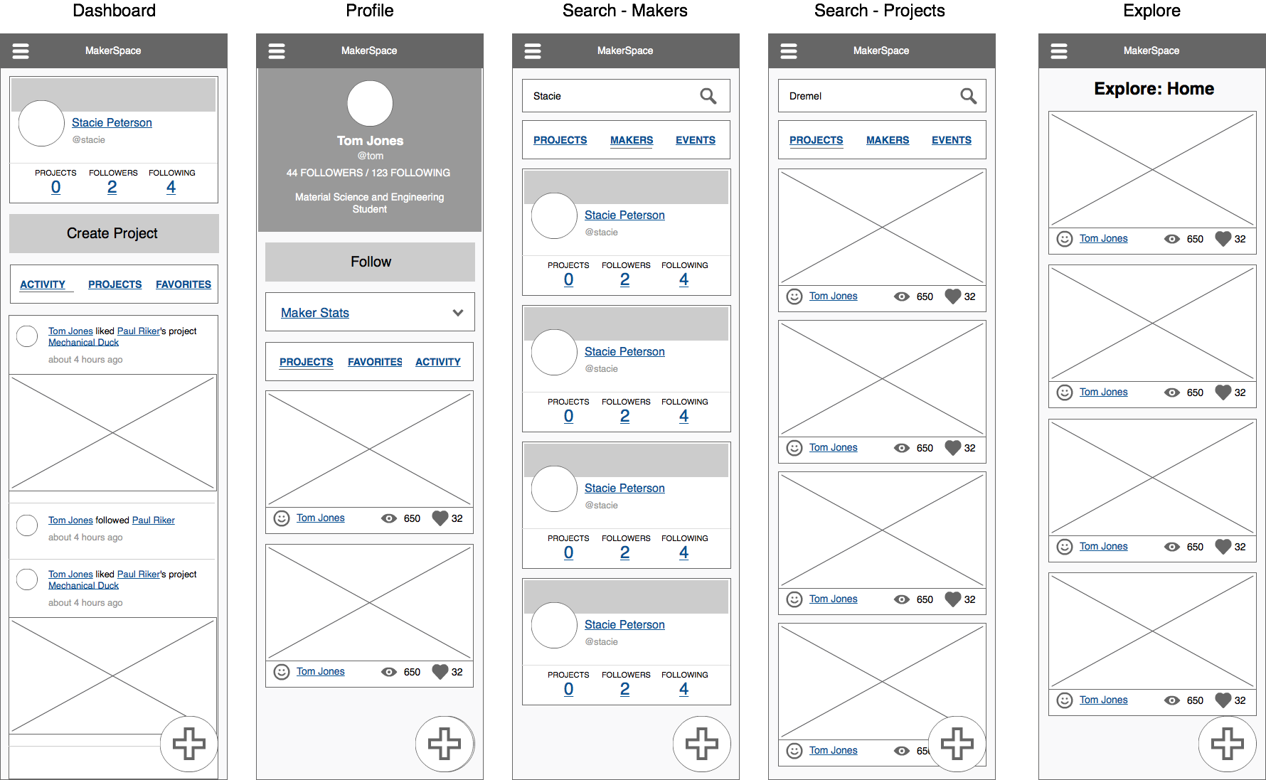
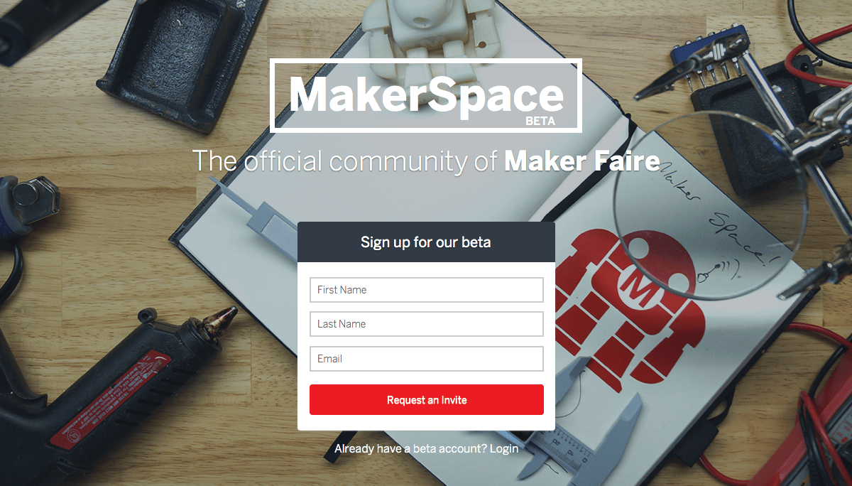
Landing page design
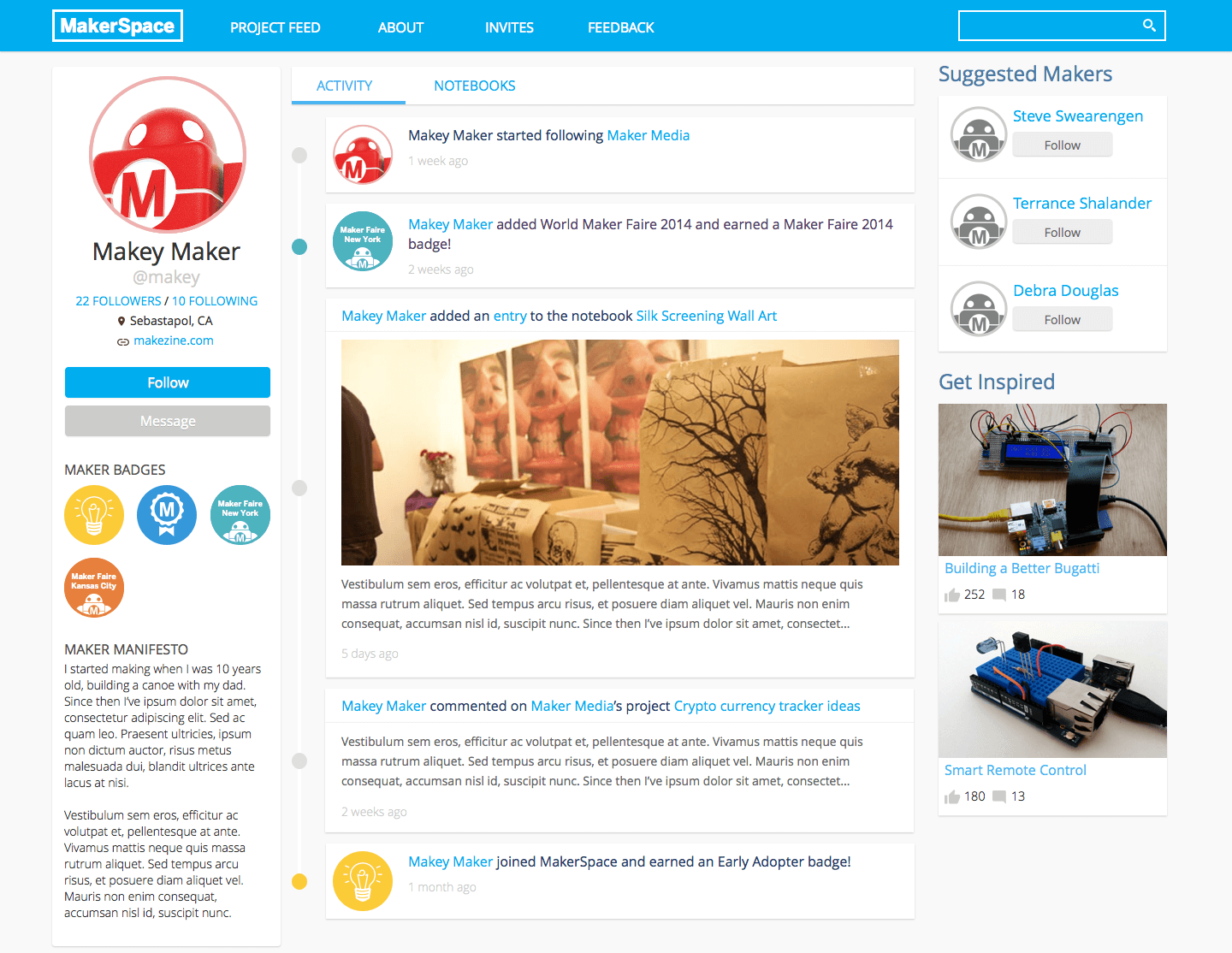
Profile design
Key design decisions
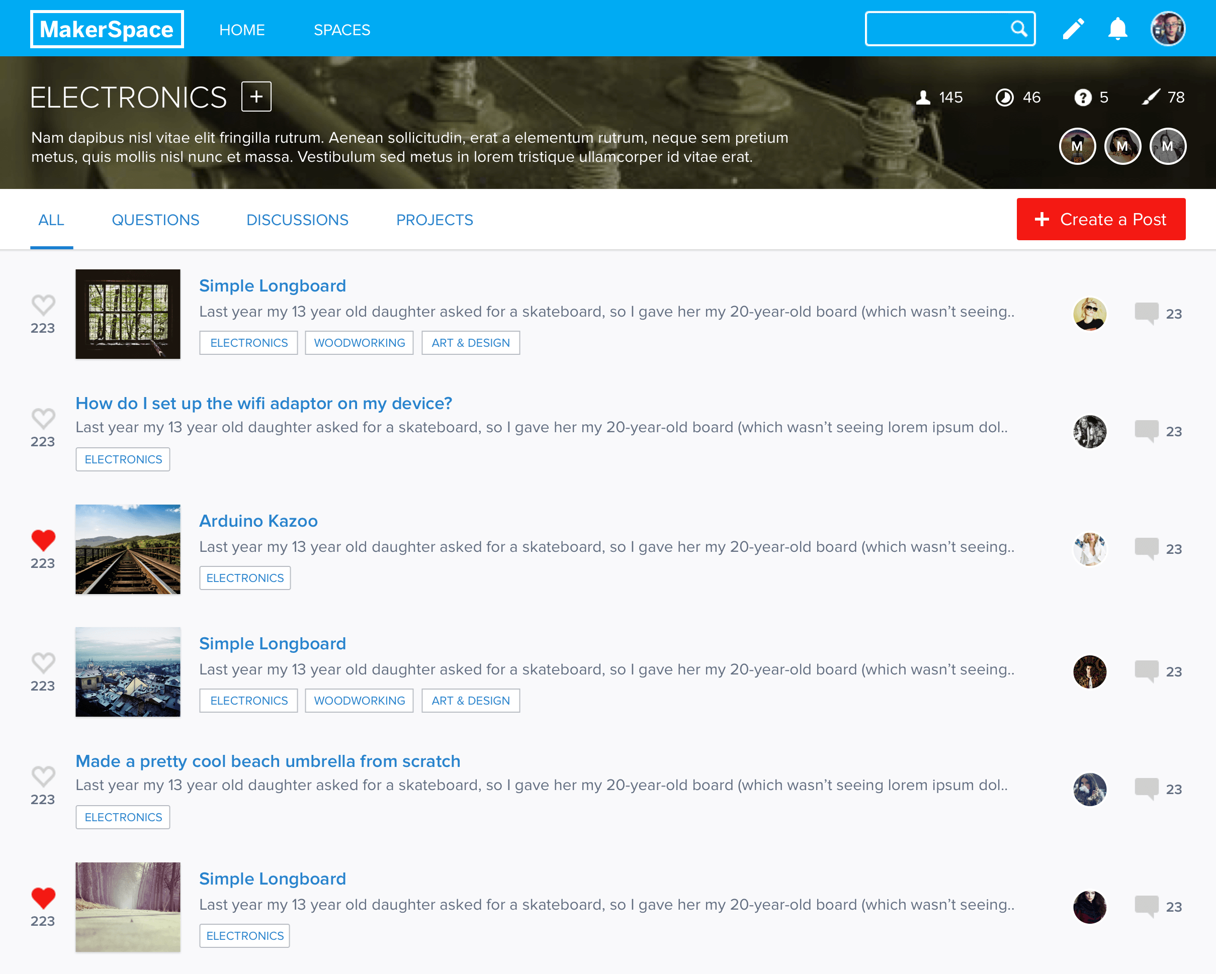
Project sharing: The heart of the platform
The most critical feature was how makers would share their projects. I explored two approaches:
| Approach | Concept | Pros | Cons |
|---|---|---|---|
| Steps as blocks | Modular units for each step | Easy to reorder, clear structure | Less narrative flow |
| Flowing narrative | Medium-style continuous story | Better for storytelling | Harder to scan steps |
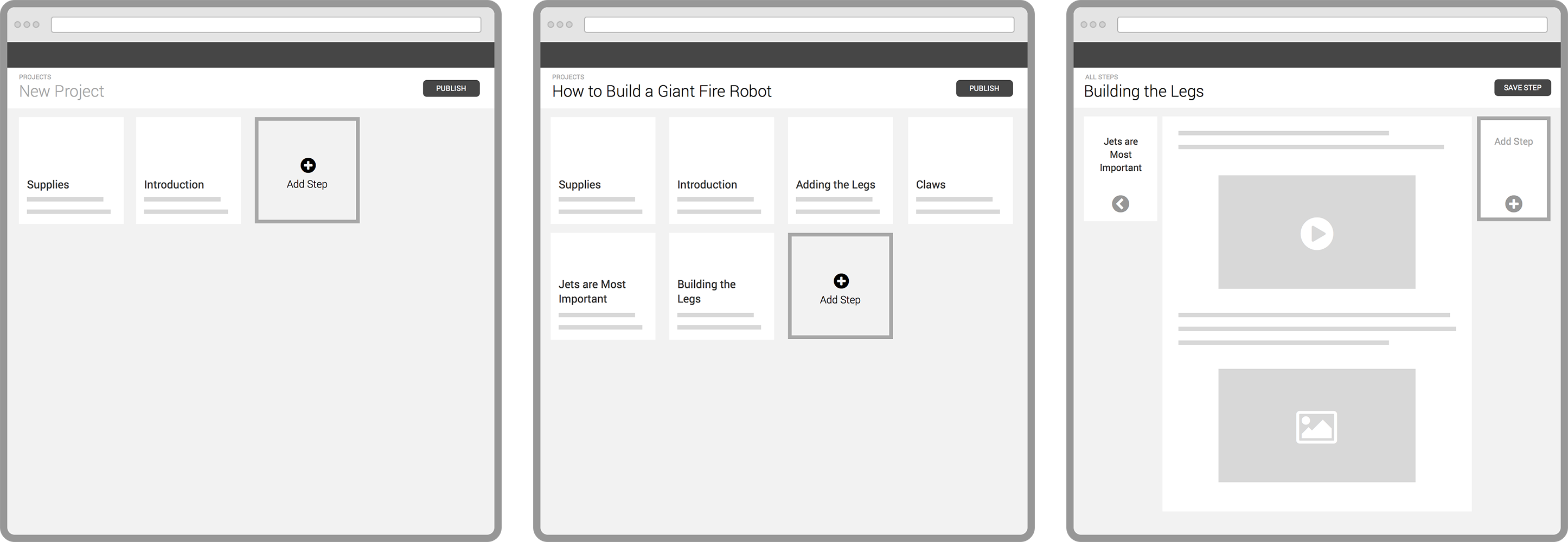
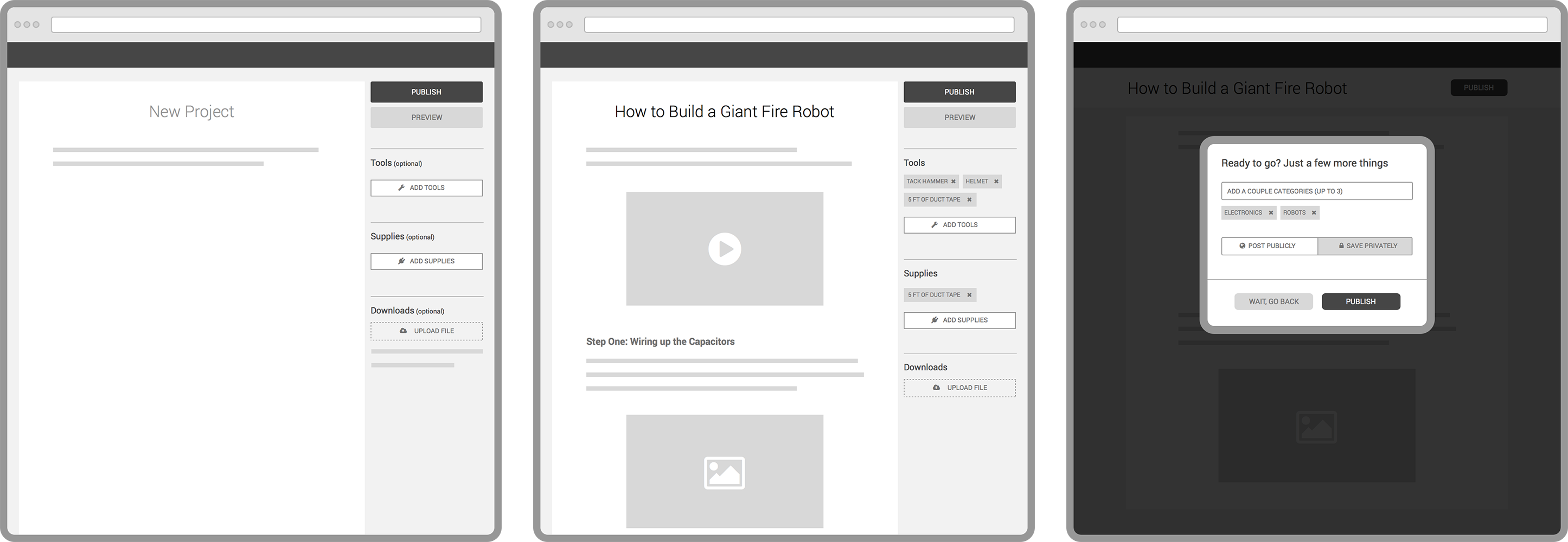
Decision: We chose the modular blocks approach. It aligned with how makers think about projects in discrete steps and made it easier to remix or reference specific parts of a build.
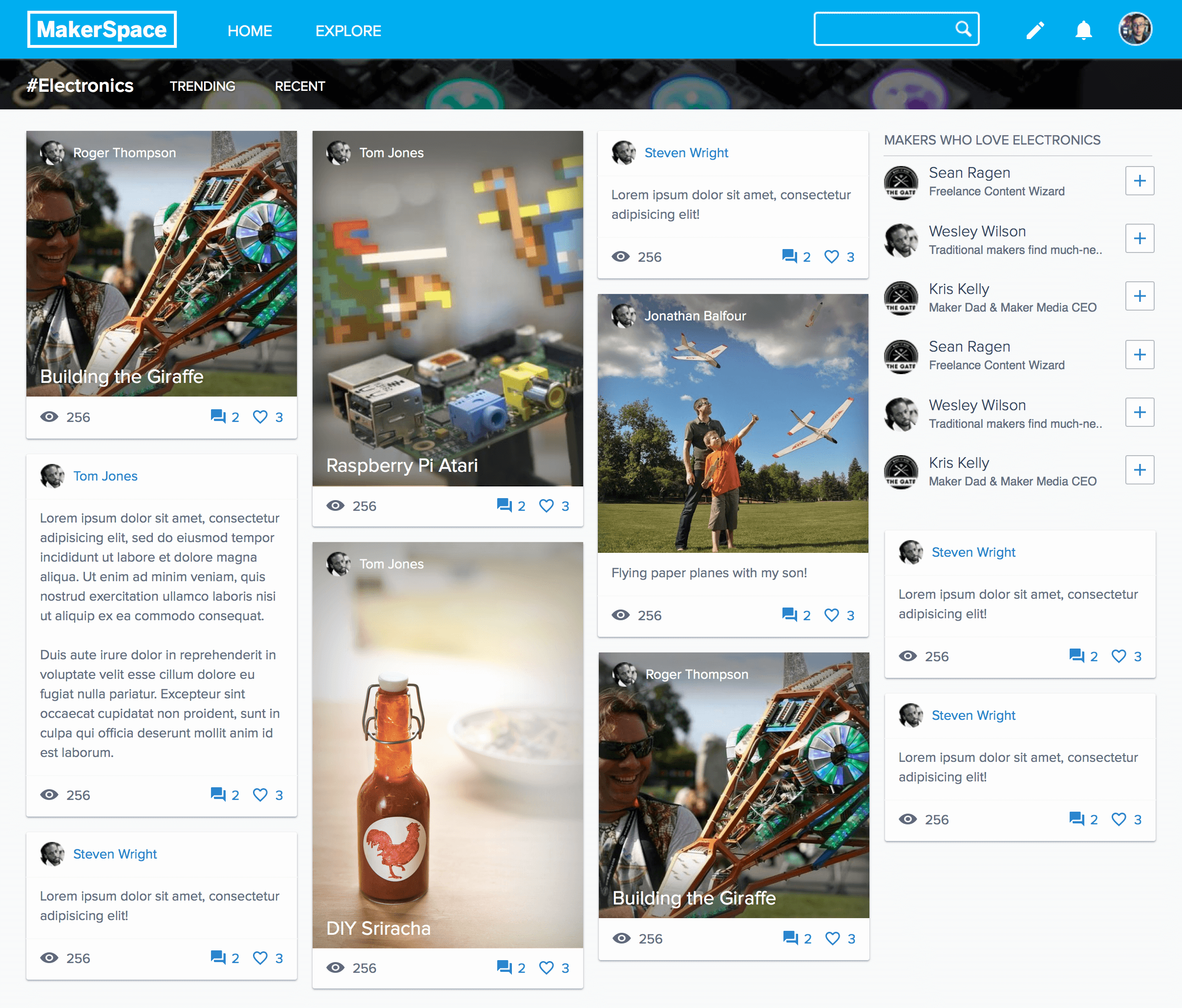
Community feed design
For the main feed, I tested a visual masonry layout against a Reddit-inspired topic-based approach. The masonry grid won for its visual impact and ability to surface diverse projects at a glance.
Launch
While building, we interfaced with the community directly, shipping daily updates and gathering real-time feedback. The platform went live at World Maker Faire New York. We set up a booth with a DIY sign, onboarded our first 700 users in person, and conducted interviews to gather immediate feedback. Launching at the event let us see how makers actually used the platform in real time.
Results & reflection
The launch generated significant press coverage in Engadget, TechCrunch, and Fast Company. More importantly, we built a platform that makers actively shaped through their feedback.
Launching at the event changed how I thought about user research. Instead of testing prototypes, we watched real makers use the real product and gathered feedback in person.